DashThis has a brand new look!

There’s super exciting news coming out of DashThis: our website is brand-spanking new!
We’ve been working on it for several months, and we’re incredibly proud of the result… seriously, we couldn’t wait to tell you all!
What’s Changed
Sometimes, when something big happens in your life, it’s nice to look back and reflect on how far you’ve come and what happened to help you get here.
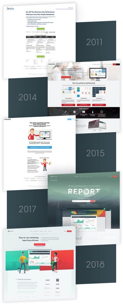
We’ve been around for over 7 years, and throughout that time, marketing reporting, and indeed the entire digital realm, has changed A LOT!
Suffice it to say, even from a purely design point-of-view, let’s just say we’ve come a long way from where we started:

Obviously, our look has evolved quite a bit… and honestly, it’s constantly going to be evolving.
But the truth is, who we are hasn’t changed a bit.
Yeah, we grew from 8 employees to 31 in just the past two years. Our team has expanded to include not only expert software developers, but also world-class designers, marketing specialists, customer success specialists, and much more.
But this growth that we’ve undergone doesn’t make us any different. Indeed, throughout the hiring process, our team has always made sure to hire people who put clients first.
Skills can be learned.
Motivation and a caring attitude… not so much.
So through the market changes and the internal changes, we’ve always made sure to remember our roots and stay close to them.
What we do, how we do it, and how we present ourselves to the world… that’s where the changes are.
How We Got Here
At DashThis, we rarely do things on a whim.
Sure, sometimes we’ll decide it’s a beautiful day and all go out to have a long-lunch together out on a patio somewhere.
But if we’re talking about things that AREN’T food-related, the decisions we make and the actions we take are thoroughly thought-out and most likely, hotly debated.
Remaking our website is no different. In fact, this might have been one of the most elaborately thought-out decisions we’ve ever made.
Last year, we started pouring over every reporting tool that exists, figuring out what marketers actually needed in a tool, and what was out there for them.
We started with a pretty straightforward exercise: looking over every other tool’s website, and putting together a list of everyone’s tagline and main selling point(s).
What we figured out was pretty obvious, albeit a bit jarring when you put it all onto an Excel spreadsheet: we. all. look. the. same.
Seriously.
We all have just about the same ingredients on our websites: a tagline stating that we provide a reporting tool, several shots of our interface, a list of features, a list of our integrations, so on and so forth.
Although it makes sense to present our tool in these clear-cut terms, it makes it exceedingly difficult for agencies and marketers to know which is better for THEM and THEIR needs, since there seems to be very little difference between all the tools on the market.
But here’s the thing: we AREN’T all the same. Sure, we offer similar products for similar types of users, but when it comes to automated tools that you’re using to make your work-day easier, the devil is in the details.
And those subtle but super important details just couldn’t be seen in the website we had previously.
That’s when we decided to go back to our roots and really show-off who we are… not what we thought the market wanted us to be.
Who We’ve Always Been
When we figured out that we were trying too hard to fit into the same mold as every other reporting SaaS, we knew what we had to do: let our users lead the way.
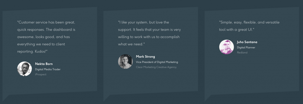
The account management and marketing teams looked over every single comment and review that users, past and present, wrote. And we figured out which themes were repeated the most.
Pretty quickly, we found that users tended to love us for two big reasons: how easy our tool is to use, and how amazingly kind, fun, and dedicated our account management team is.

There was our niche, our selling points, our differentiators.
Why try to be something we aren’t? And more importantly, why NOT show who we really are?
We aren’t some huge BI tool that does all sorts of data manipulation; we neither want to be, nor do we need to be.
Why not?
Because that’s not what our users need.
Our users need a powerful tool that gets them a beautiful-looking report in 5 minutes flat. That’s what they need, and that’s what we do.
Easy-to-connect integrations.
Multiple sources in one dashboard.
Pricing based on number of dashboards, none of this you-get-this-feature-but-not-that-one nonsense.
Oh, and second-to-none customer service no matter what plan you choose.
Because our users also want to be able to get actual human answers to their questions; no one wants to go through pages and pages of community forums to find answers, and no one wants robotic, stiff answers either.
And since “love of the job, with a side of silliness” is pretty much a prerequisite when getting hired at DashThis, our account managers know that a crisp video answering a user’s question with a fun Lord of the Rings GIF sign-off never killed anybody, right?!
So it’s then and there that we started transforming our website into something fresher and more pared down.
We’ve never been the type of business to create a tool and then search for users that would be a fit. Instead, we’ve found users that have a specific need, and we’ve built a product that answers that need.
And if that’s how we develop our tool, why shouldn’t our website be the same?
And if our tool is constantly changing and improving, why should our website stay stagnant?
So DashThis crew, users and friends, this one’s for you.
What do you think? Does it look like us?
Ready to automate your reporting?
Read More
Don’t miss out!
Automate your reports!
Bring all your marketing data into one automated report.
Try dashthis for free

