Make your Personalized Dashboards Look Good

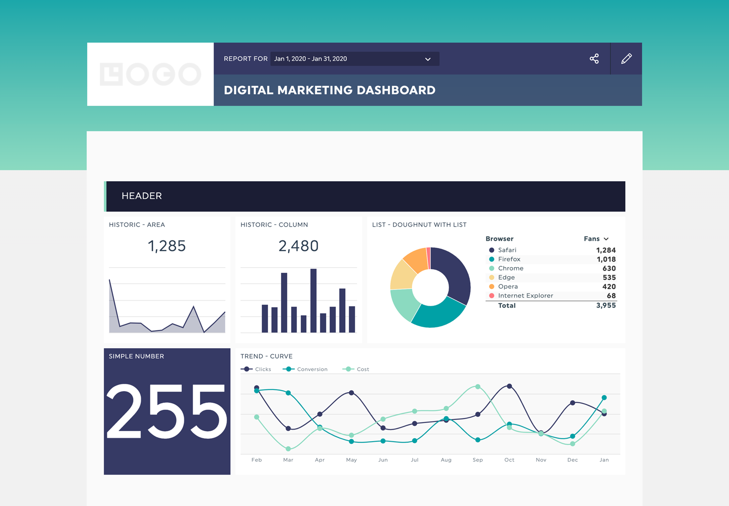
We know that, just like us, you care tremendously about your clients. Sending personalized dashboards, with relevant images that look good, and that represent their brand is one of many good ways to show your clients how much you care. This is why adding your client’s logo in the dashboard’s dedicated space is always a good idea.
Sometimes, however, the logos you add appear blurry, or may look weird when combined with your personalized dashboards’ default colours in DashThis.
Fear not, for this is no dead end: you can totally overcome your logo issues with these two very simple solutions.
1. Use the correct logo dimensions and resolution
A good way to ensure your client’s logo looks good is by adjusting the resolution to 72 dpi (dots per inch) and the dimensions to 250 by 125 pixels. Use .jpg or .png formats, and make sure to select a file without any transparency. That way, your logo will come out as neat as possible!

2. Change your personalized dashboards’ background
Sometimes, the colours of your client’s logo just don’t match with DashThis’ default background. In such cases, you can always explore custom options for logo design to better align with your client's brand identity.
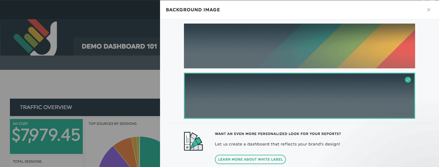
By clicking on the background though, you’ll be able to choose from two background images: the default one, or a charcoal gray one, which, according to my very own DIY skills, matches perfectly with pretty much any other colours! How great is that?

Now, although this should help quite a bit, we know some of you may wish to take the personalized dashboards game even further. Don’t worry, dear marketers, DashThis has got your back.
3. Colour themes
You can very simply add one of our 8+ preset colour themes to add a new colour scheme to your dashboards.

4. White label options
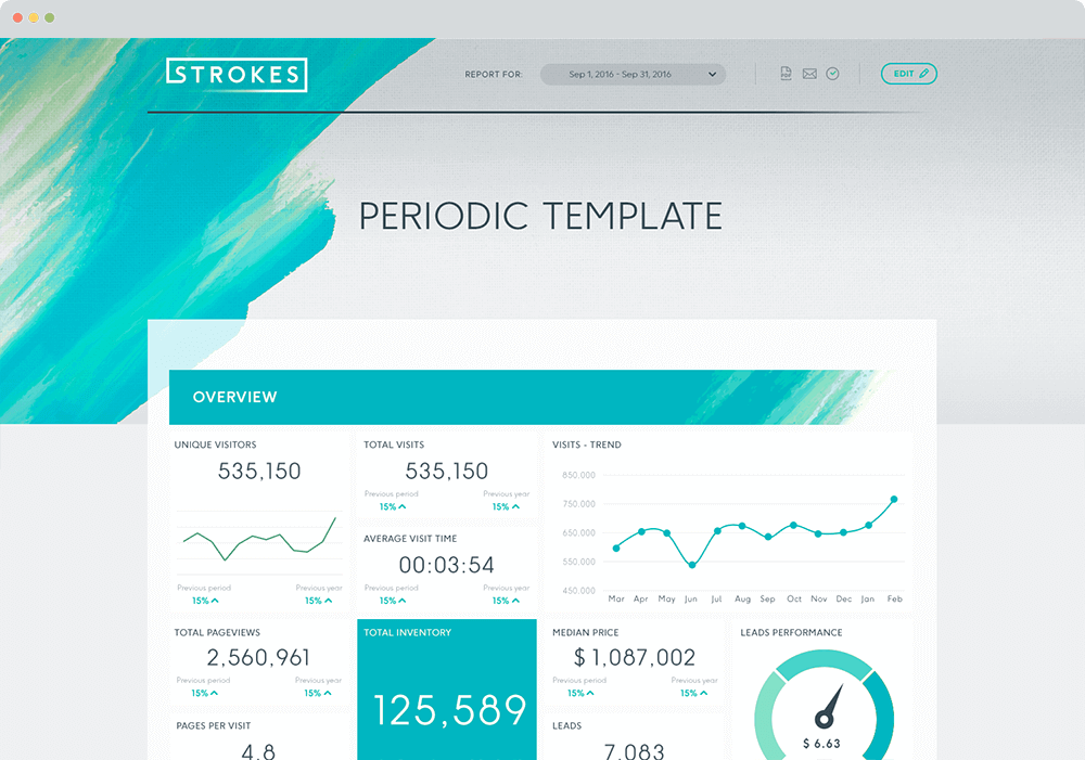
With DashThis, everything about your dashboard can be customized, from the URL, to the design, to the whole development. You can get personalized dashboards that truly reflect your or your clients’ brand with our white label options.

Wanna know more? Take a look at our white label options!
Happy reporting!
Ready to automate your reporting?
Read More
Don’t miss out!
Automate your reports!
Bring all your marketing data into one automated report.
Try dashthis for free

