Let Your Digital Dashboard Breaaathe

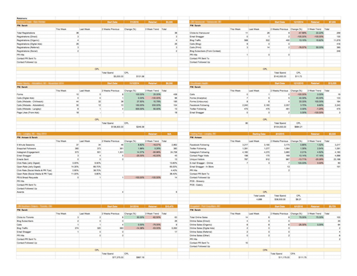
A huge part of quality reporting is to visually simplify concepts that can otherwise be hard to decipher. Often times, however, digital dashboards appear as all-dressed pizzas with extra data. Is that what you’d call simplification? I think not.

Keep It Simple
So how in the world can this be avoided? Well, the solution is super easy. Ready? Take a deep breath… aaand let it go. That’s it. Simple as that: your digital dashboard needs to breathe.
There’s no need to try to show a thousand stats and trends in a single document. If it seems overwhelming to you, keep in mind it’ll probably look even worse to your client. Focus on what’s essential for your client to know and pick your widgets accordingly.
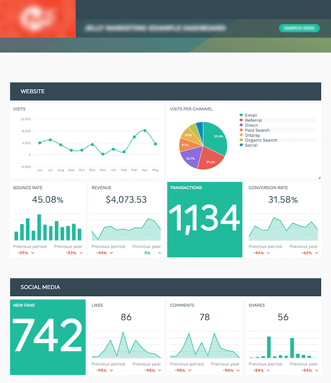
“Less is more!” claims every Pinterest addict, and DashThis employee of this world. Nobody likes to receive a digital dashboard cluttered with a hundred widgets, and scroll down for two whole minutes. Select 23 or 24 relevant KPIs and stick to that.
Unclutter your digital dashboard by dividing it into precise sections. Use headers to clearly identify each section, so your client knows exactly where to find the answer to a specific question he may have about his marketing results.

Now, if you’re only getting started with your digital dashboard creation, you might think of it as a little overwhelming. What KPIs should and shouldn’t you keep track of? What could your sections be?
If you need a nudge to get you off to a good start, think about using one of our preset templates (we have quite a few of those, the Analytics Report template being one of them). It’ll allow you to start reporting in a nick of time, in addition to giving you a pretty darn good idea of how to awesomely structure your future digital dashboards.
Happy reporting!
Ready to automate your reporting?
Read More
Don’t miss out!
Automate your reports!
Bring all your marketing data into one automated report.
Try dashthis for free

