Behind the Scenes of Our New Flexible Period Dashboards

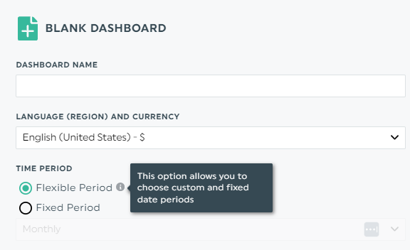
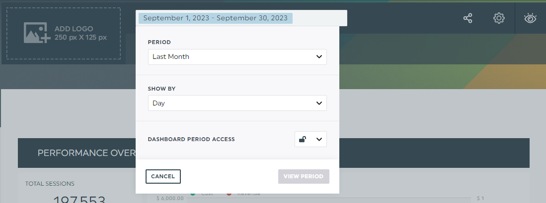
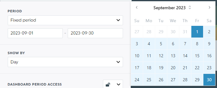
We're thrilled to introduce you to a highly-anticipated new feature - Flexible Period Dashboards! This feature will completely change how you share and interact with your reports, allowing you or your clients to tailor the date ranges of the dashboards or specific widgets according to your preferences.

Given the extensive collaboration across our departments and the significant impact on our clients, we're taking a unique approach in this article. We'll dive into this feature by talking with two of our talented developers, Olivier and David, who played essential roles in its creation.
We’ll get into the development process, the inspiration behind the feature, and the hurdles they had to overcome. Plus, we’ll discuss what’s coming next!

- The development journey
- - The inspiration behind implementing flexible period dashboards
- - Technical hurdles encountered during development
- - Collaboration and teamwork involved in this project
- What’s in it for you?
The Development Journey
Alright, folks, brace yourselves for the backstage pass into the making of Flexible Period Dashboards!
So, first things first, you need to know that our app, DashThis, was built with a specific structure in mind, one where dates were static. We knew (and our client helped remind us) that it was time to change that, but it wasn’t as easy as it seemed. It took over two years of careful planning, overcoming hurdles, and going back in time to edit our entire app.
The inspiration behind implementing flexible period dashboards
Well, we can’t ignore the fact that being able to edit dates on a dashboard is pretty much an industry standard these days; the truth is that most of our competitors have been offering this feature for a few years. Our sales team has been championing our approach for years because adding flexible dates to a dashboard adds a layer of complexity. Why mess with what’s working?
But with the increased demand, we had no choice but to catch up with the industry. Our clients have been waving flags, saying, "Hey, we need more flexibility here!" So, why not simplify things as well? We also have this mishmash of dashboards - periodic, campaign, rolling – and it’s time to standardize the offer for our users.
Two birds, one stone. We decided to dive in, but that was over two years ago. So, what happened?
Technical hurdles encountered during development
Regarding performance, we needed a more efficient approach to handle the flexibility we aimed to offer customers. We strived for an iterative approach, closely listening to user feedback, even if it meant a bit more time in development. For example, we initially didn't plan to prioritize dates in the widgets until much later, but it was in such high demand that we moved it up into the beta phase. We’ve also been in the beta phase for a few months, and thanks to our client’s precious feedback, we adjusted as we went and reprioritized accordingly.

Also, we mostly used a synchronous system, meaning we had to wait for each operation to complete before moving to the next phase. Transitioning to an asynchronous approach can allow us to perform operations in parallel, which saves time and money, but it can’t be half-assed. Simply implementing this structure is a huge thing, but we decided that for this project, it was worth it.
Lastly, we had to leverage many cutting-edge technologies to help us optimize performance. A significant challenge we faced involved striking the ideal balance between cache management and data retrieval, a balance that would enable our customers to access the precise amount of data in the least time possible. We're proud to say that we were surpassing limitations at a slower rate than Google's native reporting tool.
Collaboration and teamwork involved in this project
Epic teamwork and collaboration made this project come to life. Simple as that.
Our development team was practically giddy about the opportunity to dive into uncharted waters and, as one described it, engaged in a little "mad scientist stuff." This was also one of the most requested features, so seeing it come to fruition was exciting. What’s awesome is that most of our developers had a role in the project, either contributing at any given time or providing valuable support.
The project evolved with its fair share of trial and error. Developers came in and out of the project, but the overall vision was well-defined from day one.

What’s in it for you?
As we roll out Flexible Period Dashboards, we're all about giving you choices: you can use it or stick with the original solution. Why? Because we value your input and want to hear your feedback. We're committed to improving your reporting experience without sacrificing what's already working for you. We won't replace methods that have been working; for some of you, this is your preferred method.
So, you don’t want to use flexible period dashboards? You don’t have to. Your old dashboard doesn’t have to change, and you can take as much time as you want to familiarize yourself with the feature before going full force.
Well, there you have it, folks – the thrilling tale of how Flexible Period Dashboards came to life! 🎉
You’ll also be using the first version of this feature, which will evolve. The heavy lifting has been done, but there’s always room for fine-tuning; this is where your feedback will matter most. If you have any suggestions or comments, please don’t hesitate to contact our support team.
Thank you for being a part of our DashThis community!
Try our new flexible period dashboard
Read More

Don’t miss out!
Automate your reports!
Bring all your marketing data into one automated report.
Try dashthis for free
