9 Executive Dashboard Examples for CEOs to Power Up

How do you create an executive dashboard that effectively conveys ROI?
In today’s guide, we’ll look at nine different executive dashboard examples, the vital elements to prioritize on, and how you can create them in the blink of an eye.
- What is an Executive Dashboard?
- What Should be on an Executive Dashboard?
- Executive Dashboard Examples
- - Executive Dashboard Example
- - Ecommerce Dashboard Example
- - Digital Marketing Dashboard Example
- - SEO Dashboard Example
- - PPC Dashboard Example
- - Social Media Dashboard Example
- - LinkedIn Business Dashboard Example
- - Analytics Dashboard Example
- - Email & Marketing Automation Dashboard Example
- Wrapping Up: Executive Dashboard Examples
- - Less is More
- - Visual and Convenience
- - Context Matters
What is an Executive Dashboard?
An executive dashboard is a visual report that shows a high-level view of your business’s key performance indicators (KPIs).
Here’s an example to illustrate what we mean. Check out this dashboard below created using DashThis. It gives the CEO (or CFO) a peek at the financial data in August right off the bat.
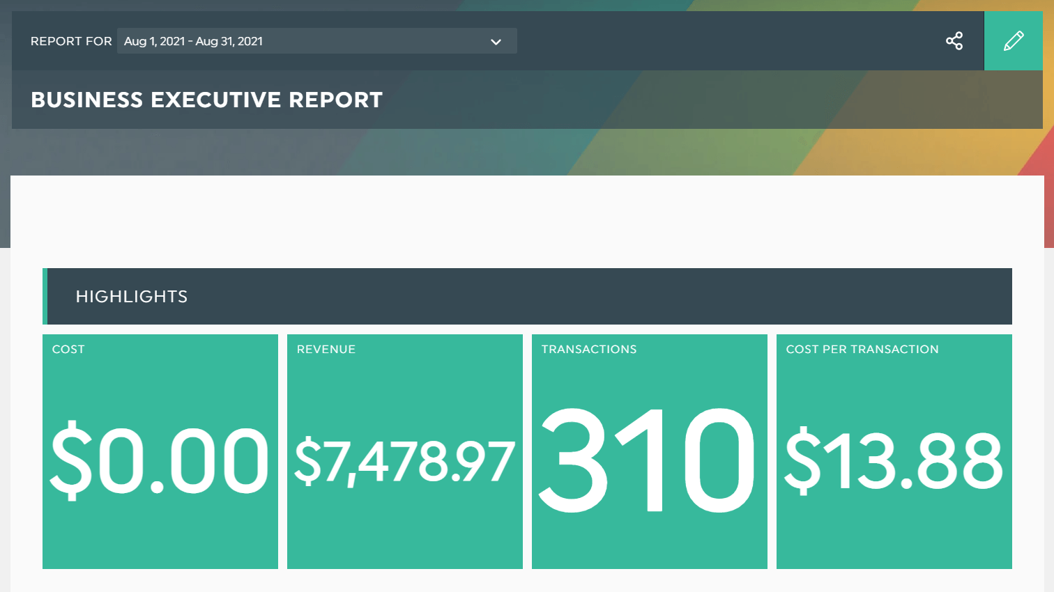
Create your executive management dashboard using an automated reporting tool. You can connect your data sources in one place and easily access your performance metrics within seconds.
Grab this business executive dashboard with your own data!
The executive dashboard is an asset in every busy executive’s life. It shows whether you’re crushing your strategic objectives at a glance, so that you can speed up decision making by a mile.
What Should be on an Executive Dashboard?
An effective executive dashboard includes revenue-driven key metrics.
Ideally, you should present these metrics in a readable and interactive format. That way, you can extract actionable insights without any difficulty. It’s a business intelligence tool, after all!

A robust dashboard software helps you analyze profitability data sets without requiring you to squint your eyes. Take that, Excel.
In other words, make sure these marketing metrics show how your marketing efforts impact your business’ bottom line distinctly.
Executive Dashboard Examples
Executive Dashboard Example
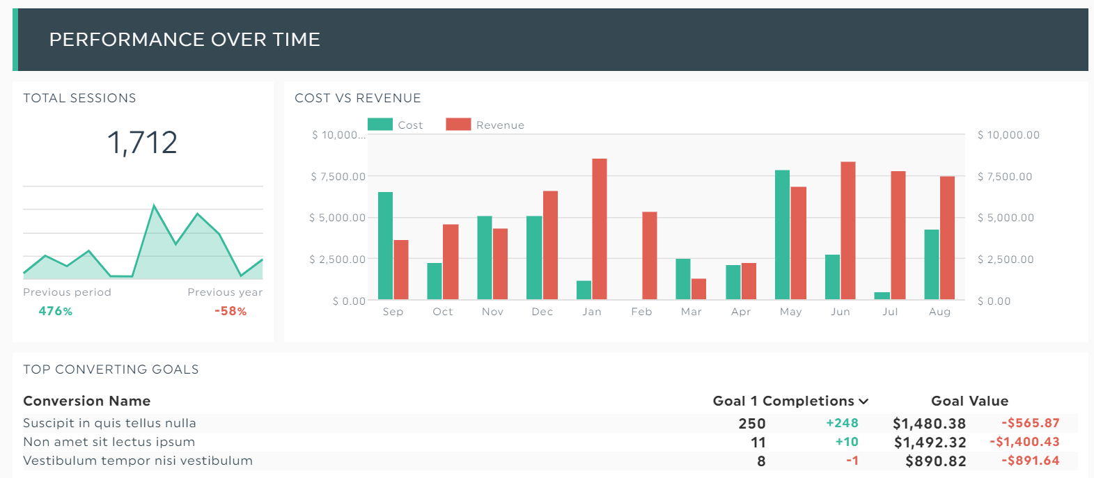
C-suites are responsible for execution across all channels, so the executive dashboard should reflect top-level metrics that drive decisions forward.
Grab this business executive dashboard with your own data!
A CFO looking to analyze the business’ profit margin will find this cost vs. revenue bar chart helpful.
Ecommerce Dashboard Example
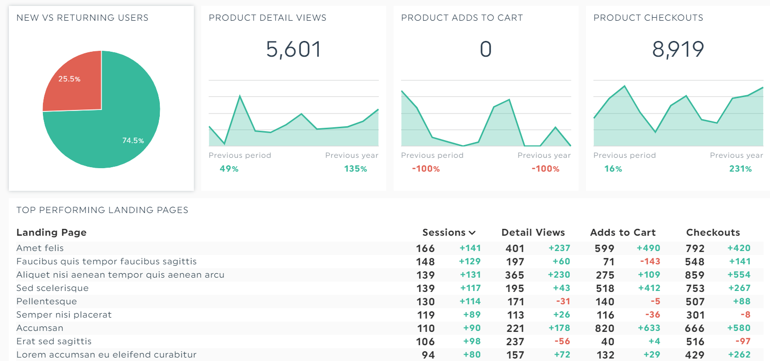
This ecommerce dashboard breaks down several ecommerce metrics, including product detail views and total number of checkouts.
Grab this ecommerce dashboard with your own data!
Quickly analyze data at a granular level and improve the shopping experience. Whether you want to understand your customers’ behavior flow or boost retention, this ecommerce dashboard’s got you covered.
Digital Marketing Dashboard Example
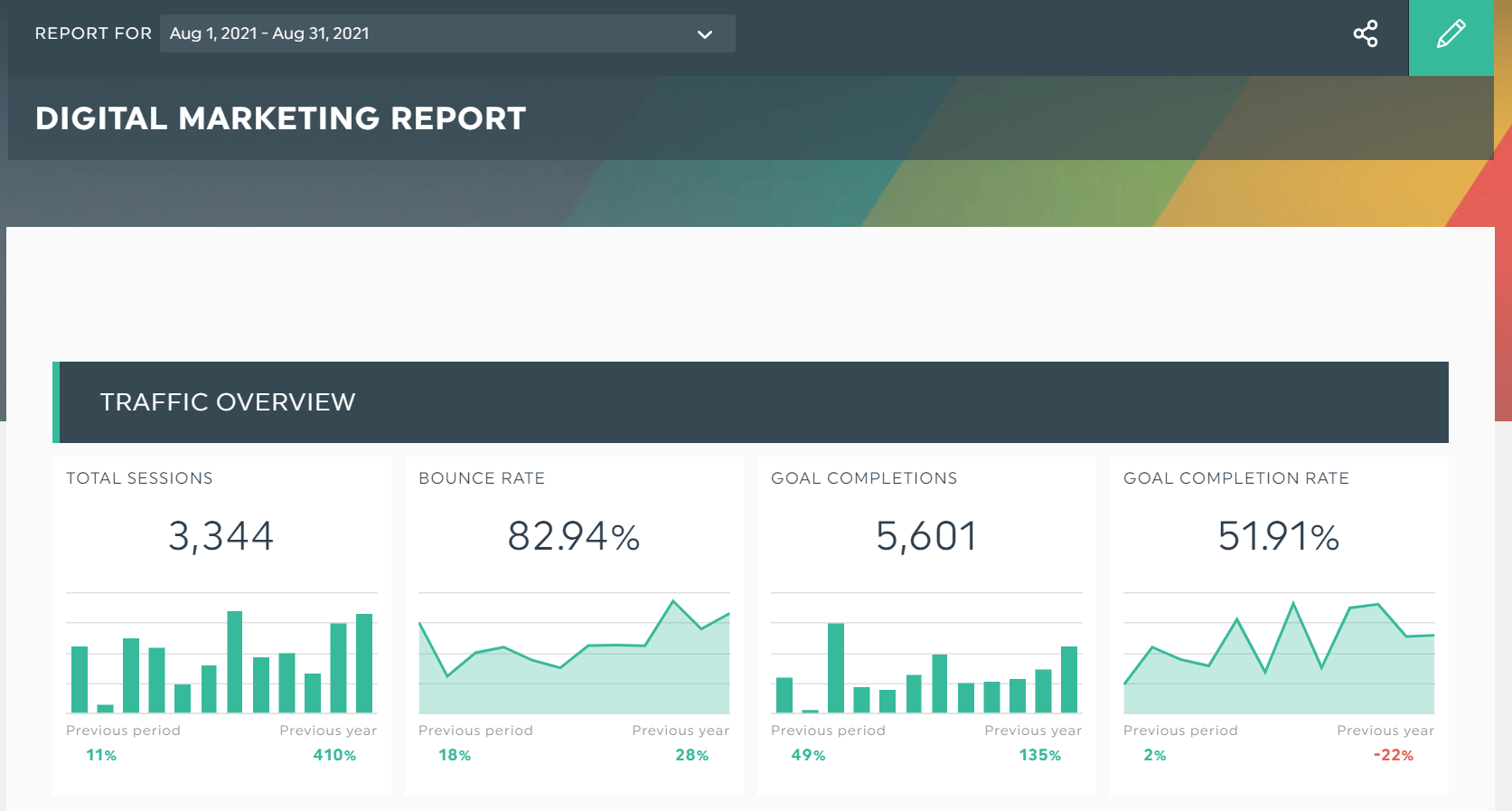
The digital marketing dashboard visualizes how all channels and campaigns fit together in a hybrid strategy.
Grab this digital marketing dashboard with your own data!
Combining SEO and PPC, this sleek report guides you on maximizing visibility on the search engine results page (SERP).
SEO Dashboard Example
Want to fill up your sales pipeline for the remaining year? Look no further than this executive dashboard chock-full of SEO KPIs.
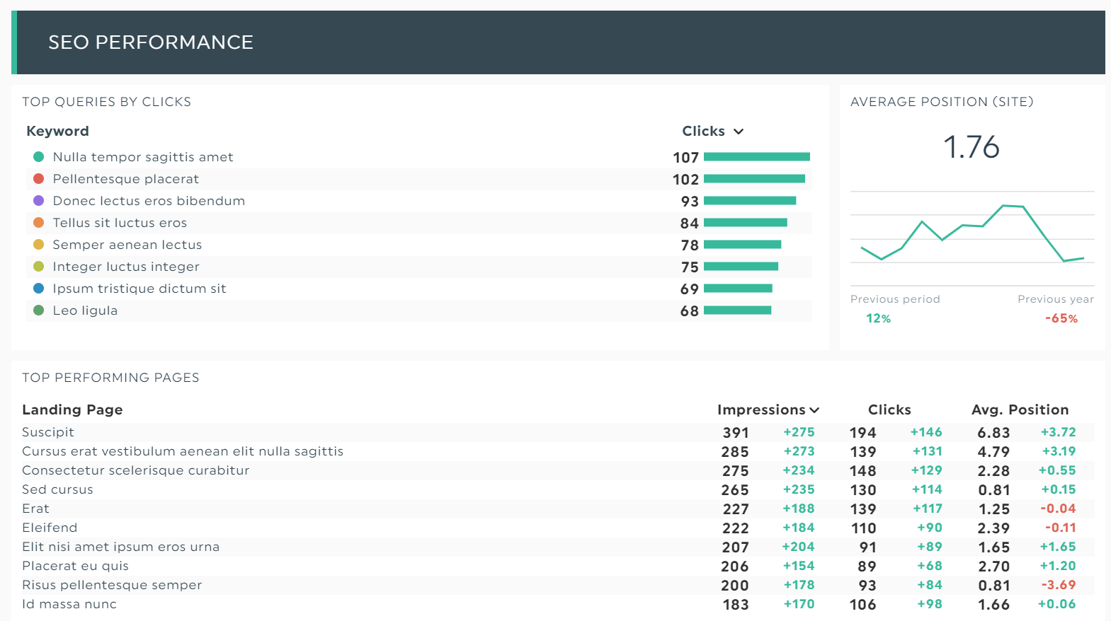
Grab this SEO dashboard with your own data!
From optimizing your product page with the best-performing money keywords to kicking your rivals’ butt on the SERP, this SEO dashboard sets you up for long-term success.
PPC Dashboard Example
The PPC executive dashboard provides all the data you need to boost fast traffic and brand recognition with remarketing.
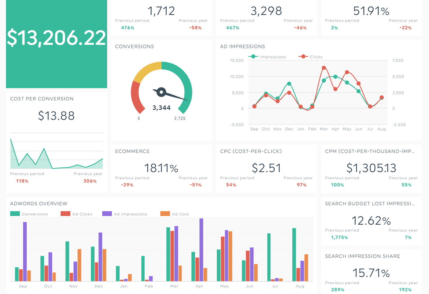
Grab this PPC dashboard with your own data!
Note how this dashboard turns the PPC KPIs into a visual representation of the ever-changing trends.
Social Media Dashboard Example
This multi-channel dashboard combines all the social media powerhouses. With dozens of social media KPIs, it helps executives gauge which platform is the best for marketing their business.
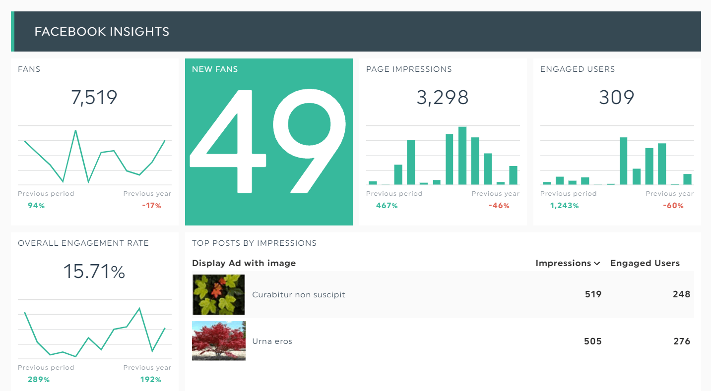
Grab this social media dashboard with your own data!
You can even drill down to the specific display ad posts that brought in the highest engagement with images!
LinkedIn Business Dashboard Example
A no-brainer for B2Bs, you can’t ignore the LinkedIn business dashboard when it comes to attracting attention from the big kahunas.
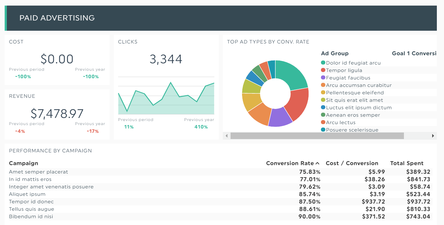
Grab this LinkedIn business dashboard with your own data!
Why big kahunas? Well, that’s because LinkedIn is home to 61 million top decision-makers within organizations.
Analytics Dashboard Example
Google Analytics: The cornucopia of real-time data.
Discover where your best customers are coming from in this executive dashboard packed with analytics KPIs. Here we have an easy-to-understand report that breaks down web traffic, conversions, and transactions.
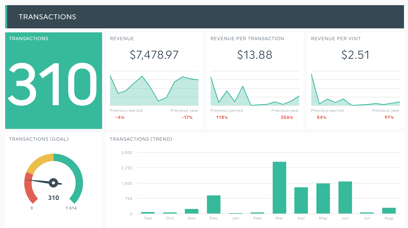
Grab this analytics dashboard with your own data!
Email & Marketing Automation Dashboard Example
This dashboard with email marketing metrics helps you understand what’s happening in your email strategy. Fix gaps in your email automation and send with confidence!
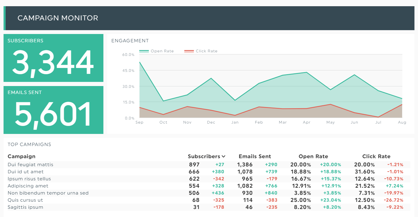
Grab this email & marketing automation dashboard with your own data!
These email data analytics are a goldmine. Dig deep and develop an action plan to boost conversion for your welcome sequence, improve your triggered emails, and more.
Wrapping Up: Executive Dashboard Best Practices
Now that you’ve learned the different types of executive dashboards, let’s continue with some of our favorite dashboard best practices.
1. Less is More
Focus on metrics that measure the success of your goals.
Ideally, it should take you only a few clicks to present these KPIs in your dashboard. BTW, this also applies when pulling multiple data sets from different sources.
- Connect your marketing channels to DashThis
- Select the KPI dashboard you’re looking for (currently, you can pick from over 40 free templates)
- Choose your KPIs
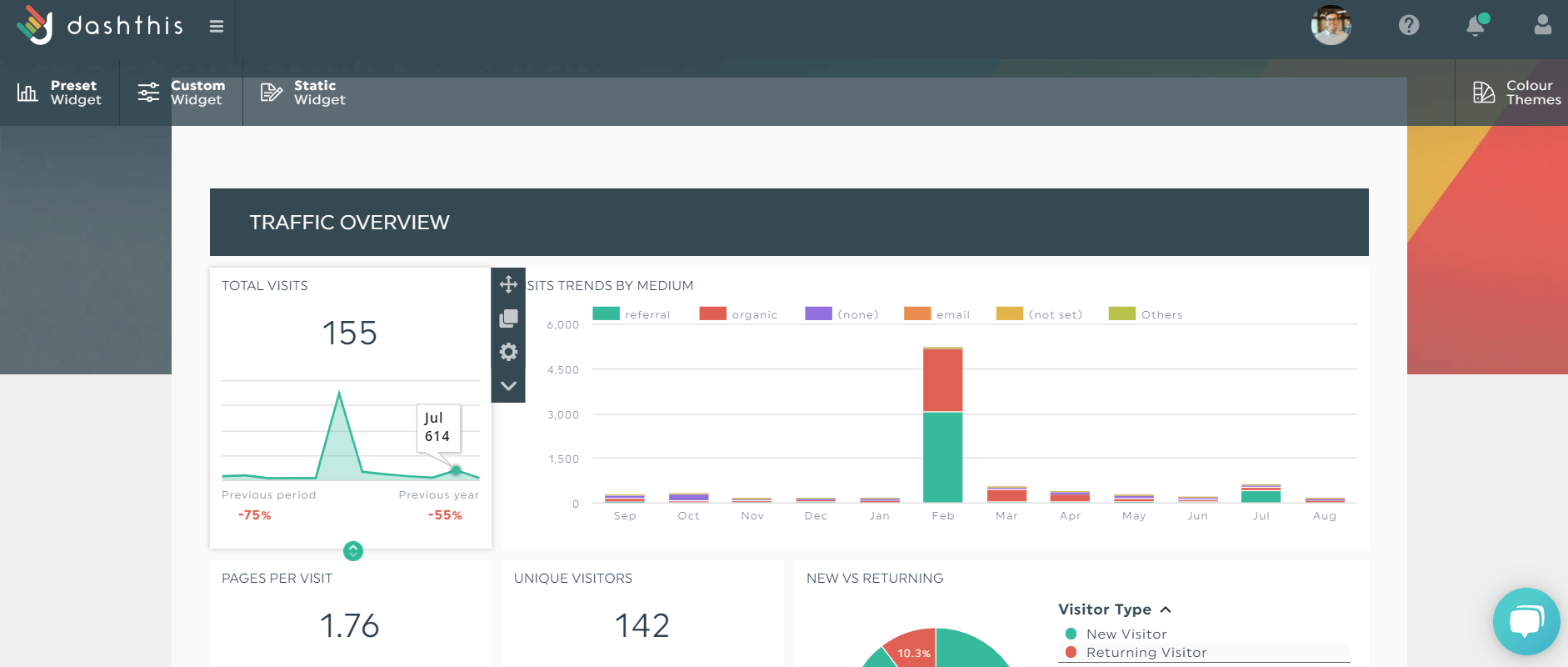
Once you click the KPIs, DashThis will automatically turn them into beautiful graphics within your dashboard
2. Visual and Convenience
DashThis’ functionality gives you convenience and peace of mind.
Add a password; share it via email, shareable link, or PDF; and more.
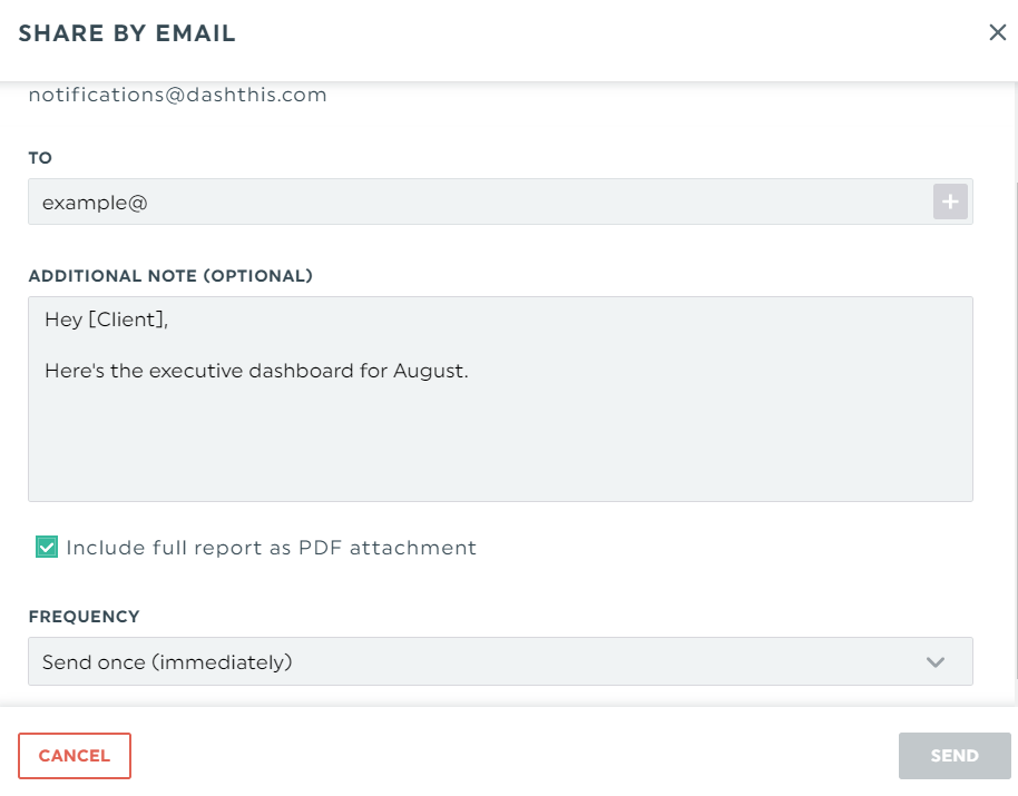
Send your executive dashboard by email. You can also include it as a PDF attachment and schedule an automatic dispatch.
Choose the appropriate chart types, play with graph sizes, group similar metrics together, or change the dashboard’s brand colors.
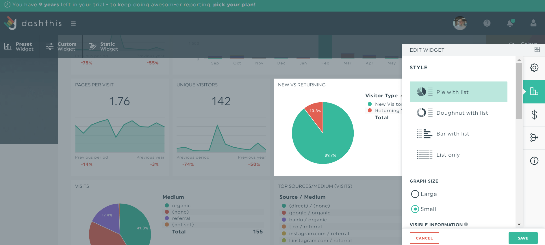
Having second thoughts about your pie chart? Change it to a doughnut, bar, or list!
3. Context Matters
Let’s say you noticed an uptick in churn. After diving into your client’s customer relationship management (CRM) software, you realized it’s caused by a recent onslaught of low customer satisfaction scores.
Add notes within your strategic dashboards to clarify your KPIs. This saves you from emailing or getting on video with stakeholders to explain the results. Click Static Widget > Comments and write as you normally would in a text editor.

Complement data visualization with education and an action plan
It’s challenging to gather data from LinkedIn, Google Analytics, MailChimp, [insert other marketing channels] without feeling overwhelmed.
Fortunately, you can do this easily and quickly on DashThis.
Start your free 15-day trial to create your executive dashboards in the blink of an eye today.
Ready to automate your reporting?
Read More
Don’t miss out!
Automate your reports!
Bring all your marketing data into one automated report.
Try dashthis for free

