How to build a stunning data analytics dashboard in minutes: A step-by-step guide

A solid data analytics dashboard is an essential yet hidden method of growing your agency this year.
But it’s not about slapping together a series of dashboards and calling it a day. When preparing a data analytics dashboard, you'll need a structured process, helpful comments, thoughtful visuals, and the right amount of information to support your client's decision-making and show your value in your client reporting.
- What is a data analytics dashboard
- How to create a data analytics dashboard that wows your client
- How to create a data analytics dashboard with dashboard software
- How to create a data analytics dashboard
- Say goodbye to the end-of-month reporting grind with DashThis
What is a data analytics dashboard?
" Reporting is a massive value proposition for new business pitches. We can demonstrate that we have an integrated dashboard that will show the success of a campaign. Clients are able to see how the campaign is performing, which streams work best in market, and which are not delivering.”
Marketing Intelligence Report, Salesforce (2022)
Rock-solid data analytics dashboards turn sterile data into insightful information. They help visualize and present data into visual graphs, charts, and tables from different data sources to drive growth.
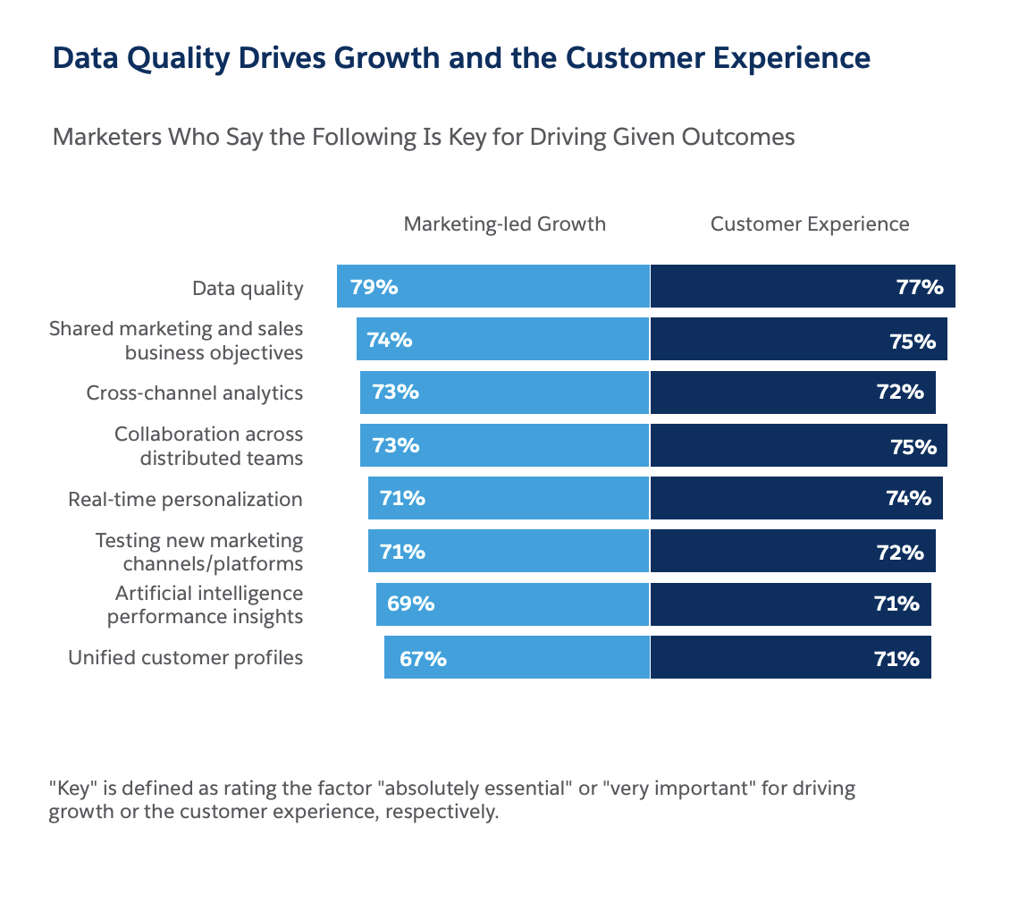
Nearly four in five marketers globally say data quality is key to driving marketing-led growth and the customer experience (Marketing Intelligence Report, Salesforce (2022)
Analytics tools like dashboards will become even more crucial to drive marketing led-growth. Here’s why:
- All data in one place: Marketers have many real-time data sources and marketing tools, and having all your key metrics in an operational dashboard with integrations makes data-driven decisions easier. Now you can quickly get your client's key multi-channel performance metrics in one easy to digest report!
- Easier to make business decisions: Data analytics dashboards help teams understand the context of current performance while having access to historical data to forecast future performance. For example, analyzing the top-performing social media posts to identify topics that resonate.
- Monitor performance: Are we on track to hit our key performance indicators (KPIs) this quarter? Where and how can we optimize our marketing campaigns? Having a dashboard helps answer these two questions. Spot ineffective initiatives and focus on what’s working with a view of your overall business performance.
How to create a data analytics dashboard that wows your client
We'll show you how to build a data analytics dashboard to help your clients take action on their data, including:
- Laying the groundwork by understanding what your client needs in their reporting
- Defining a client reporting process
- The mindset you need to bring when explaining your dashboard to your client
- How to spruce up your dashboard with visuals and notes.
Read more: Client reporting: 6 reasons why it’s so important
Step 1: Understand client needs and select the right KPIs
Understanding client needs helps you tailor your report to meet their needs and understand what business intelligence they need from your report.
Think about:
- What metrics or business outcomes do they care about?
- Who are the stakeholders they report to?
- What do their stakeholders want from them?
- What do they want to see from your report?
Let’s say your client is the demand generation manager who handles sales pipeline generation and managing marketing budget.
Metrics or business outcomes: MQLs, SQLs, customer lifetime value, cost per lead
Who are the stakeholders? Sales teams, product marketing teams
What do their stakeholders want? A consistently filled sales pipeline
What do decision-makers want to see in the report? Impact/progress on new pipeline generation and ROI analysis
Once clear on your dashboard goals, select the metrics that go into your dashboard.
As a rule of thumb, keep it between 5-8 KPIs, with only 10 KPIs in a dashboard.
If you’re unsure which KPIs to select, review our library of dashboard examples if you’re stuck trying to select the right KPIs for a specific client goal. We’ve also got 100+ KPI examples if you need a refresher on what each metric means.
Watch: A six-minute tutorial on how to build an effective dashboard.
Step 2: Define your client reporting process
Setting clear expectations with your client reduces miscommunication while creating healthy boundaries for both sides.
Consider these areas:
- How often should you report?
- When should you deliver your report?
- How should you deliver the reports?
- What level of detail should you report?
Read more: How often should you report? We break down the pros and cons of weekly vs. monthly vs. daily reports here.
Step 3: Collect and organize data
Marketers handle data across multiple platforms, from SEO to social media to Google Analytics.
Once you’ve done the groundwork, you’ll want to prepare your data. But manually cleaning, formatting, and exporting raw data across your tools is tedious. Use a reporting platform like DashThis to connect to our 34+ integrations to automatically pull data from all these different tools into a cohesive whole.
Step 4: Visualize
Does your client prefer numbers? Or are they more visual? Do they like an executive summary to skim or to pass on the report to others?
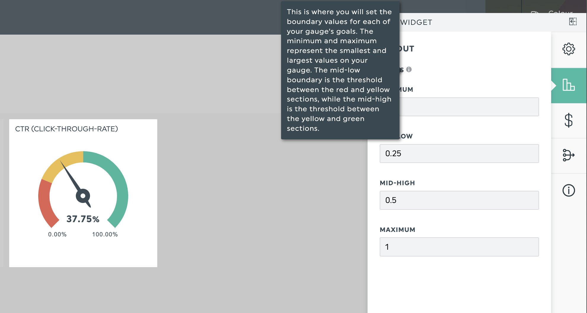
Dashboard tools like DashThis offer a variety of data visualizations to help you drive home any meaningful insights. For example, gauge charts work well when showing progress towards goals or establishing benchmarks for an acceptable click-through rate for an ad campaign.
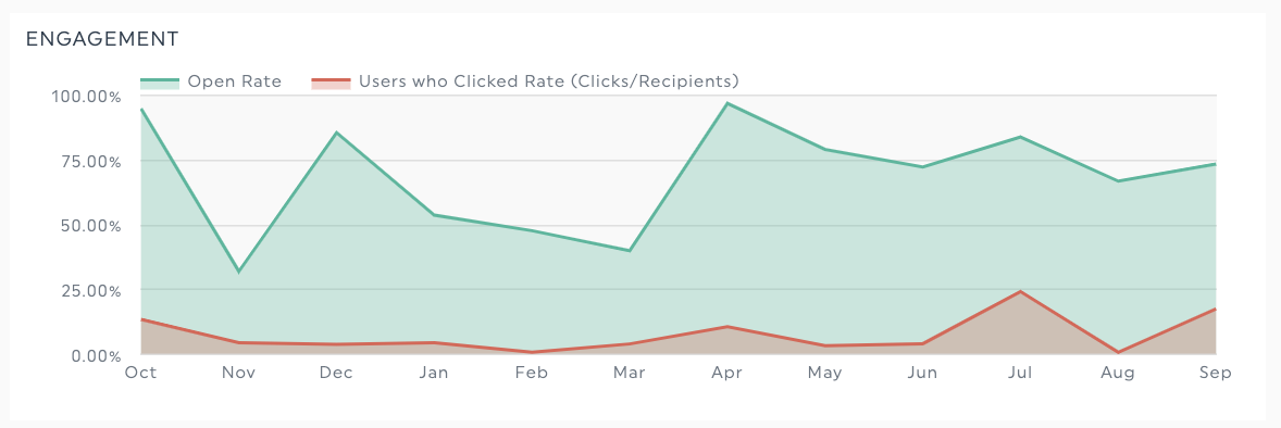
Line graphs, line charts, or area charts work well when you want to show KPI (or two) trends over time to track ongoing campaign performance, like comparing email open rates with the number of unique clicks.
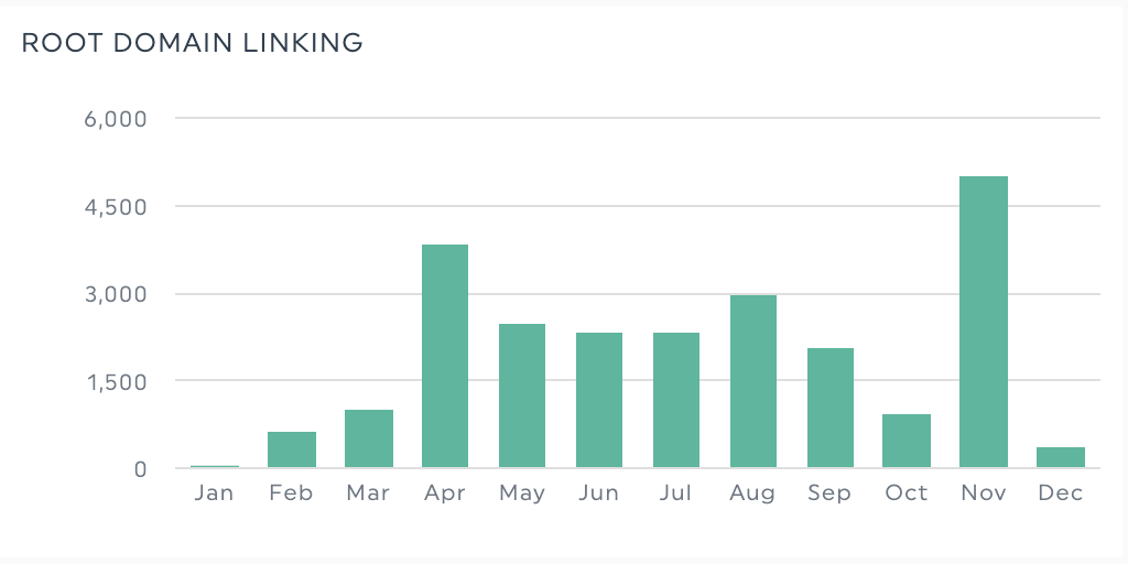
Bar charts work well for showing the change in a specific metric over time or comparing two related types of data.

Pie or doughnut charts are effective at breaking down or segmenting a data set, like segmenting the top search engines by browser used.
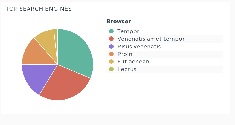
Besides visuals, tables also work well with red/green indicators to help people compare the performance of several campaigns.

Additional resources:
Article: More dashboard design tips
Our report template library with over 40 pre-filled templates, all designed for you.
Step 5. Explain
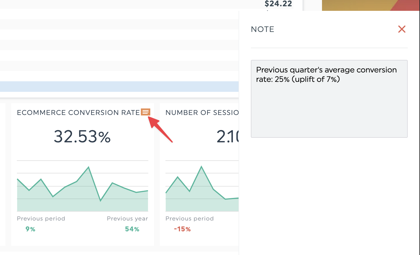
DashThis offers two features to make explanation seamless; a comment box and adding notes to widgets.
To embed a comment box in your DashThis report, go to Static Widget > Comments
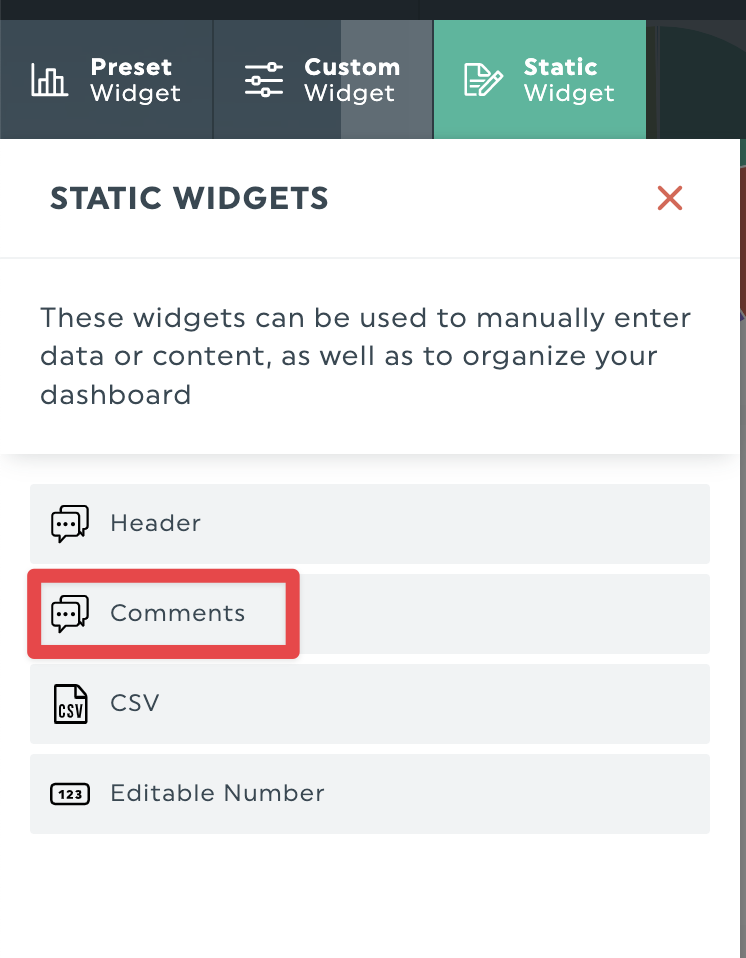
You can add high-level insights, like explaining work done this month, highlighting quick wins/losses or proposing next steps

You can also add a note to a widget to explain each chart or add context. Here’s how.
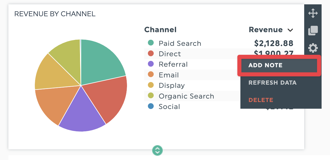
The added note will appear on the right side of your screen in a separate panel, accessible in view mode.
Step 6: Analyze
While reporting surely brings value, data simplification, analysis, and recommendations are the things that matter the most to our clients. By being simple, DashThis allows us to care less about the technical part and more about the strategic part." - Maxime Bergeron, Associate at Rablab and DashThis customer
Remember, reporting is a means to an end.
These numbers and visuals should tell a cohesive story to explain data, identify trends and patterns, and educate your client on what they can do based on the data.
Clients who understand what you do, why you do it, and how it benefits them are more satisfied and more likely to stay with you in the next billing cycle.
A simple way to explain charts or reports.
- What is happening? Are there any trends and patterns? What were we doing when there was a significant change in a metric?
- Why is it happening? Highlight your work done or any external factors that led to a metric change. This is a perfect opportunity to connect your agency’s efforts to a change in your client’s business bottom line.
- What can we do about it? Highlight what you can do to continue on a positive growth trend or course-correct to get a metric back in the right direction. It’s an excellent opportunity to highlight the costs or benefits of certain strategies and upsell your clients on your services backed with actual data.
How to create a data analytics dashboard with dashboard software
No need to create dashboards from scratch with our pre-filled templates. Here are a couple of self-service interactive dashboard templates to help you spend less time designing and more time answering business questions with analytics tools.
Google Analytics report template
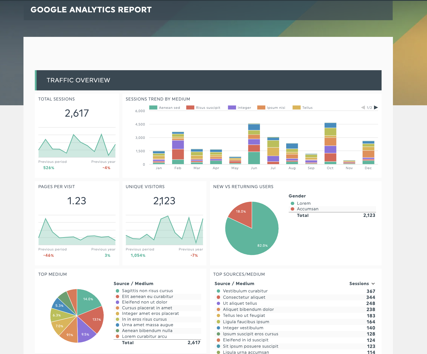
Get your Google Analytics report template with your own data
Do visitors engage with your web content, or do they bounce? Track essential web analytics metrics like new vs. returning visitors, site conversions, traffic sources, and goal completions with this template. We support Google Analytics 4 (GA4) as a native integration.
SEO report template
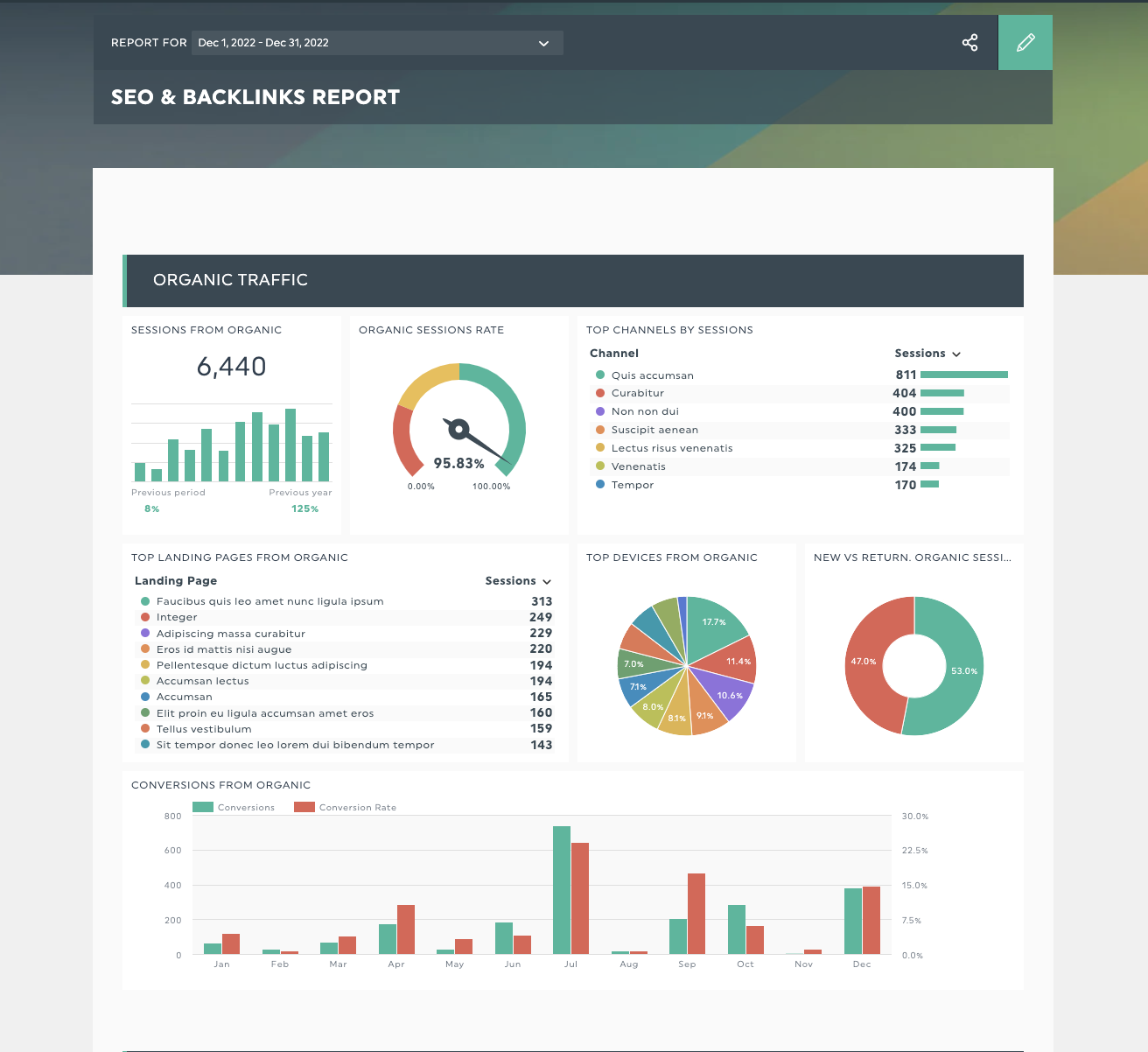
Get your SEO report template with your own data
Present your SEO metrics and efforts to your clients in a clear, understandable way. Keep your clients up to date with your SEO strategy and show them this month's performance with this template.
Executive report template
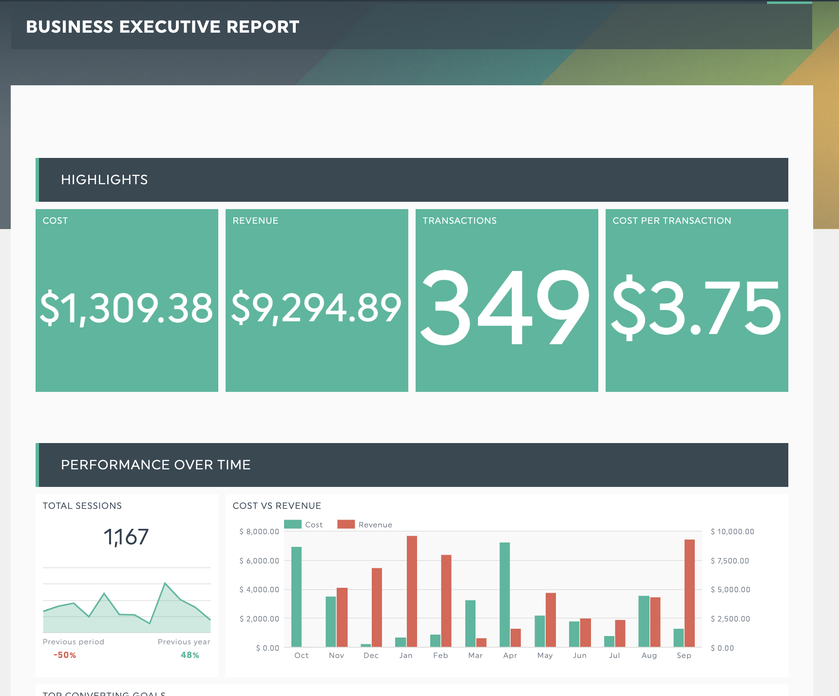
Get this executive report template with your own data
Senior executives are busy people, so get to the point quickly when presenting data. This scannable report keeps highlights at the top, ensuring your executive can glance at the report to make quick decisions, or drill down into the details.
Digital marketing report template
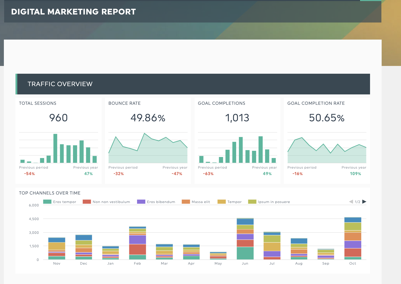
DashThis’s digital marketing report template: Get your digital marketing report with your own data
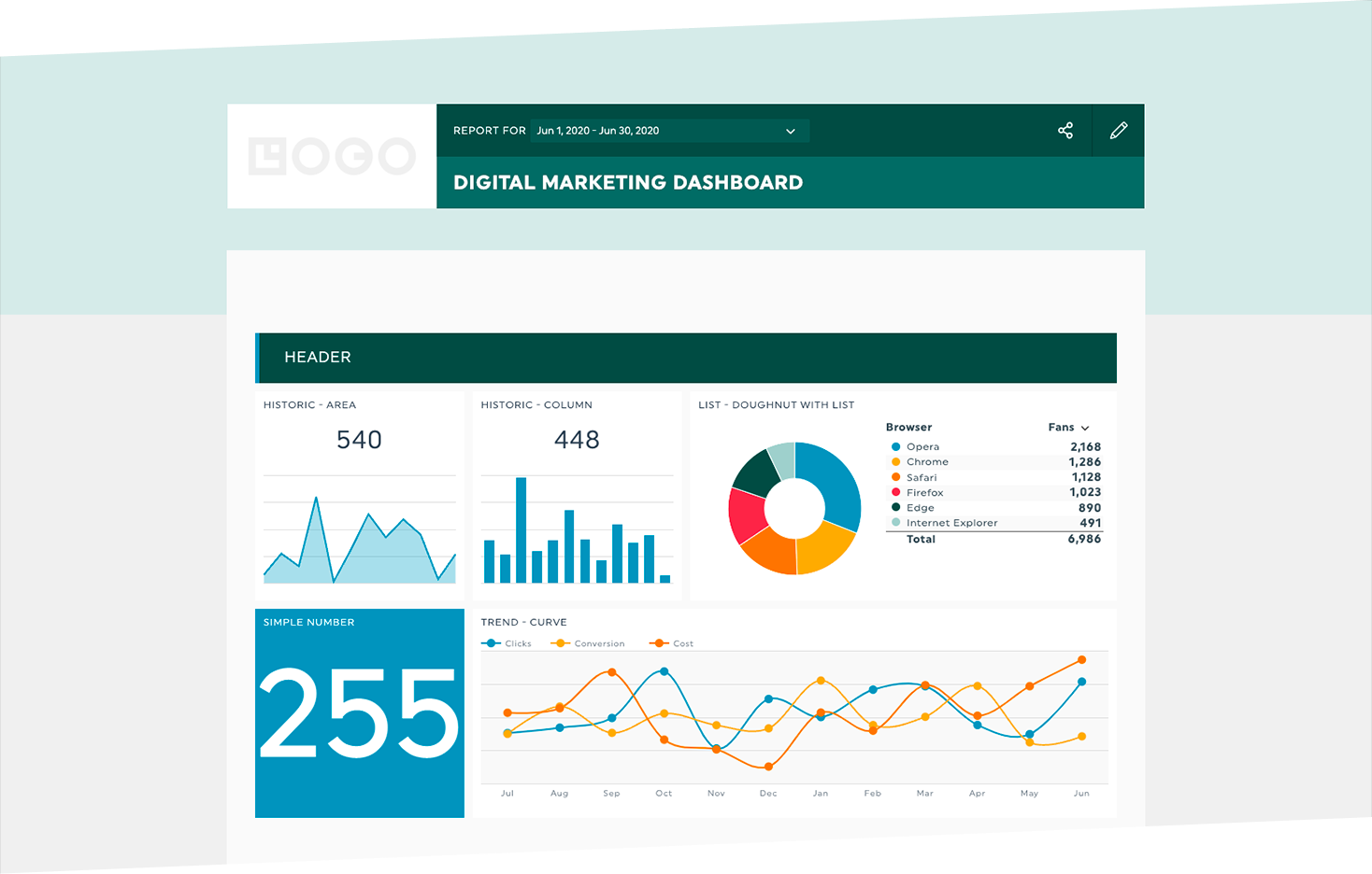
This beautifully formatted digital marketing report combines insights from all your marketing campaigns and tools in one easy-to-read dashboard. You can pull in numbers from social media, email, and more into the same dashboard to paint a complete picture of the overall strategy, a lifesaver if you run a full-service agency!
How to create a data analytics dashboard
Get started in minutes. All you need to do is.
- Connect your marketing data accounts and import your marketing data to DashThis. We support various integrations, from Google Analytics 4 to social media platforms. Import your data with a click and watch the charts automatically populate.
- Select the metrics to include from our Preset Widgets.
Bonus tip: Personalize your reports and impress your clients by adding company colors and logos to their reports with our white-labeled report functionality.
Say goodbye to the end-of-month reporting grind with DashThis
Automate the entire reporting process and get your client’s data into a sleek, customizable dashboard in their own branding - all within minutes.
With reporting automation, it’s easier to deliver more valuable reports without spending more time exporting data from your analytics platforms - a win-win situation for your team and your clients.
Ready to create an automated data analytics dashboard?
Read More
Don’t miss out!
Automate your reports!
Bring all your marketing data into one automated report.
Try dashthis for free

