Add Images to Your KPI Dashboards

One of the countless (and huge) perks of using DashThis is of course being able to create KPI dashboards that are equally simple to understand AND beautiful.
“But, my dear DashThis, what if I wanna build KPI dashboards that are even MORE eye-appealing?” I’m hearing you ask.
Well, as crazy as it may sound, you can! Want the key to the world of exquisite reports? ‘Course you do, keep on reading!
The secret: add images to your KPI dashboards
Yes, you read right! Most people don’t know that you can up your dashboard’s visual in an instant by simply adding images to it.
All you have to do is choose a “Comment” static widget, edit it, drag and drop an image of your choice, and watch the magic happen before your eyes.
“What kind of images can I use to make my KPI dashboards look glorious?” you may ask again.
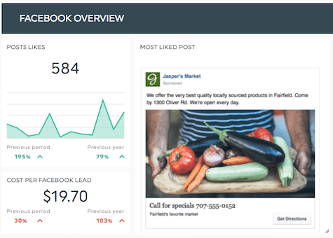
Well, for instance, you might already have a widget indicating the number of clicks on a certain Facebook post, so seeing the post in question next to this widget will obviously help the end user visualize the information.

Also, some types of data are very hard to turn into numbers. This is notably the case with geographical maps and heatmaps, which you should add directly to your KPI dashboards as they are.

Another example is if you display data about a specific employee’s sales results, placing the employee’s picture is bound to give a much more personalized feeling to your KPI dashboard.

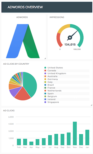
You can also use images for faster understanding purposes, by placing an integration logo in the dashboard section that’s dedicated to it.

See how breathtaking KPI dashboards look with images in ‘em? And the beauty of it all is that the possibilities are endless! Make your dashboards visual, help your clients get your point at a glance, unleash the creative beast in you!
Happy reporting!
Ready to automate your reporting?
Read More
Don’t miss out!
Automate your reports!
Bring all your marketing data into one automated report.
Try dashthis for free
